Wednesday 29 February 2012

Improvements

I have now added in my final photos to the cover. I have also started to experiment with typography for both the masthead and the coverlines. Here are screen prints of the current changes I have made while experimenting with text and the look with the final photos.


Feedback: Improvements

After getting the feedback I have decided to make changes mainly with the photography and typography. I have started to re-create my drafts; using elements from the draft i have re-done the majority of my cover adding new fonts, photos and changing areas of my layout.
COVER:
In the feedback they suggested I make several changes to my cover' mainly reguarding my typography within both the masthead and the coverlines' as well as the size and position of these. I agree with the comments they made and I have therefore decided to change the typography of my masthead to make it stand out better and look more interesting. I am also going to take the full stop out my title as it wastes space and doesn't add anything to the title.
I am also going to now add in my final photos, as this will help to improve the overall look. The test shots i used for the draft were poor quality and let the cover down.
CONTENTS:
The feedback showed me that my contents was the stronger of my pages, and that i had little to change to do with layout. However, I do need to add in my final shots to improve the photography and professional look of the page. I also, similarly to the cover, need to work on my typography and experiment to find a more interesting look. I also need to experiment with ways to emphasise some elements.
DOUBLE PAGE SPREAD:
With my double page spread, the feedback showed me that I need to rearrange my layout to make the text fit better. i also need to add my new photos in and edit some other elements.

Tuesday 28 February 2012

Draft Feedback

Alice Hoar Draft Feedback

Evaluation Questions: Draft

MEDIA Evaluation Questions

Photography

The photos used in my draft cover, contents and double page spread where all taken from my test shots, they are therefore not my final images. However, using these shots in the draft helped me to see what changes i'd need to make with my final photos. For example; i found that the images were quite bad quality and therefore needed editing; i also needed to change my lighting.
Here are some of my final shots taken for my media product:


Sunday 26 February 2012

Peer Assessment Feedback For Draft

Here are my peer assessment feedback sheets; I agree with the comments and found them useful for seeing where I need to make improvements.

Friday 3 February 2012

Publisher

The institution that would publish my magazine is Prometheus Global Media.
Prometheus Global Media publish Billboard, a pop magazine from which i have taken a lot of inspiration. I therefore think my magazine would fit in with their other publications. However, i also think my magazine would stand out and give them good sales as it is more focused on a female audience and fashion elements, as many of their other magazines do not.
Prometheus Global Media is and American Entertainment publishing company based in New York. Using a well-established American publisher would help to widen the audience as it has a wider distrubution.

Mock-Ups

Mock-Up Cover

Mock-Up Contents

Mock-Up Double Page Spread


Double Page Spread: First Draft Interview

Sapphire Interview

Pitch Evaluation: Response to comments

Audience: My music magazine would be brought by a pop music fan with a specific interest in chart music. This person would be typically female and a 'trendie'.
Model: I have decided to use a mid shot or full body shot for my cover to best show the outfit that i use; as i want to have a heavy emphasis on the fashion as well as music. I will pick an outfit for the model by taking inspiration from famous singers within my genre such as Jessie J and Lady Gaga; as i want  the style used to connotate links with these artists.
Title: I want my masthead to be big and bold, taking up the majority of the top third. This will help to emphasise the magazines name and help it to stand out; whilst also implimenting the conventional rule of thirds.
Colour Scheme: I have decided to stick with my original colour scheme of Black, White and Orange, as i felt this was a well recieved idea in my pitch. The use of bright colours will help it stand out and the use of orange, as an uncommon colour for a magazine, will make it look unique and original.
Cover: my cover is going to use the conventional rule of thirds.
Photos: I hope to use shots from gigs and concerts on my contents page to show the other elements of my magazine.
Cost: My magazine will cost £3.00, as this is an average price for a magazine containing the amount i intend it to contain.

Test Shots

Mid Shot - Action shot

Low Angle - Full Body Shot

Close Up - Action Shot

Location Shot - Full Body - High Angle

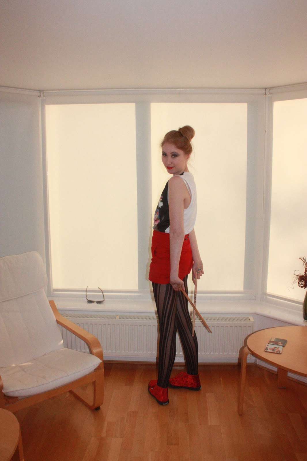
Mid Shot - Location Shot - Use of prop

Mid Shot - Action shot

Mid Shot

Close Up - Direct Eye-line

Close Up - Action Shot

Full Body Shot

Full Body Shot

Low angle shot

Close up - Action shot

Mid Shot

Mid Shot - Direct Eye-line